Lessons from the Making of Indiana University's Design System
Envisioning a Unified Brand Experience for a Complex Organization
Role: I lead design and vision casting as Assistant Director (Design)
Credits: Too many to name —the entire IU Creative Services Office collaborated in research, development, and content strategy
Methods: Design Strategy / Stakeholder Workshops / UX Design / Prototyping & Testing
In 2014 I joined Indiana University’s creative services office leading design at an opportune time — three major campus sites were slated for a redesign, and we were leading the largest brand refresh in IU history.
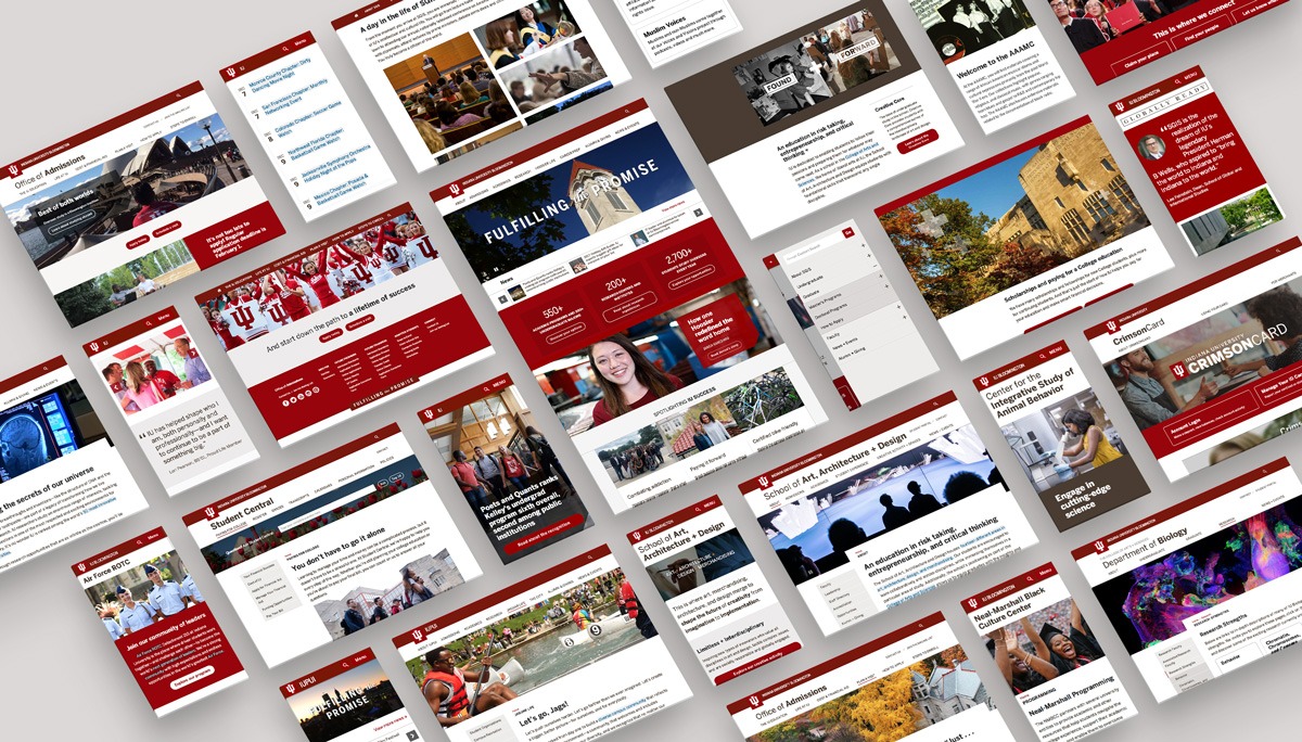
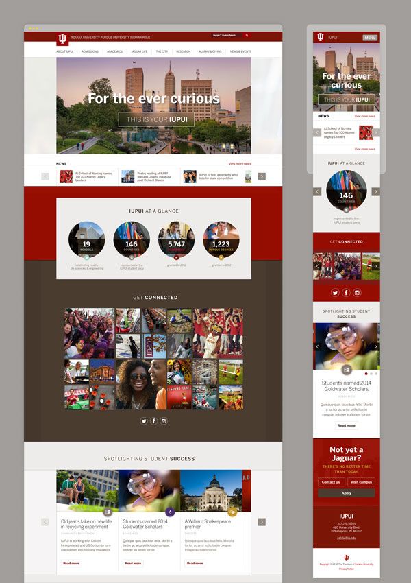
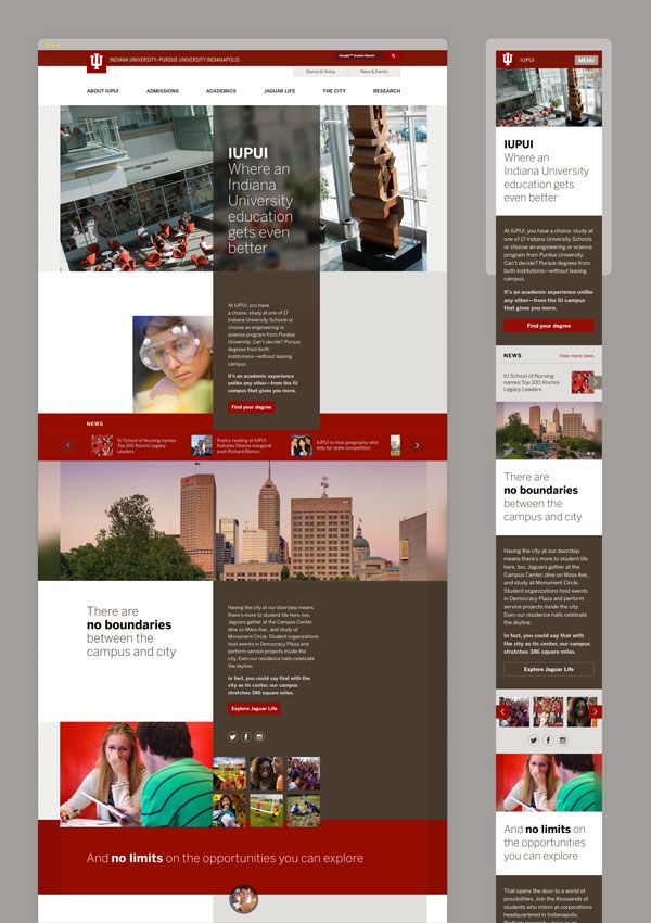
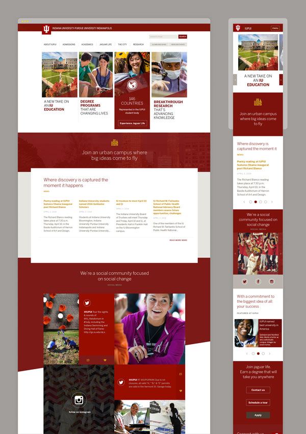
Our webspace was in dire need of an update. We knew we could do fewer things better. A simple redesign wouldn't solve the biggest design problems, so we cast a vision and seized the opportunity to create a mobile-first, content-driven design system. It has since been used to create more than 400 IU websites.
Problems
A Fractured Brand Experience
To parents, IU’s homepage gave an impression of their children’s first home away from home. For students, it introduced a new potential future. For both, it was the beginning of a confusing journey through a major life decision and application process.
We needed our sites to be a clear representation of IU's academic strengths, beautiful campuses, and the rich student life. If our webspace was supposed to be a cohesive expression of the University’s brand, our sites didn’t feel like it.
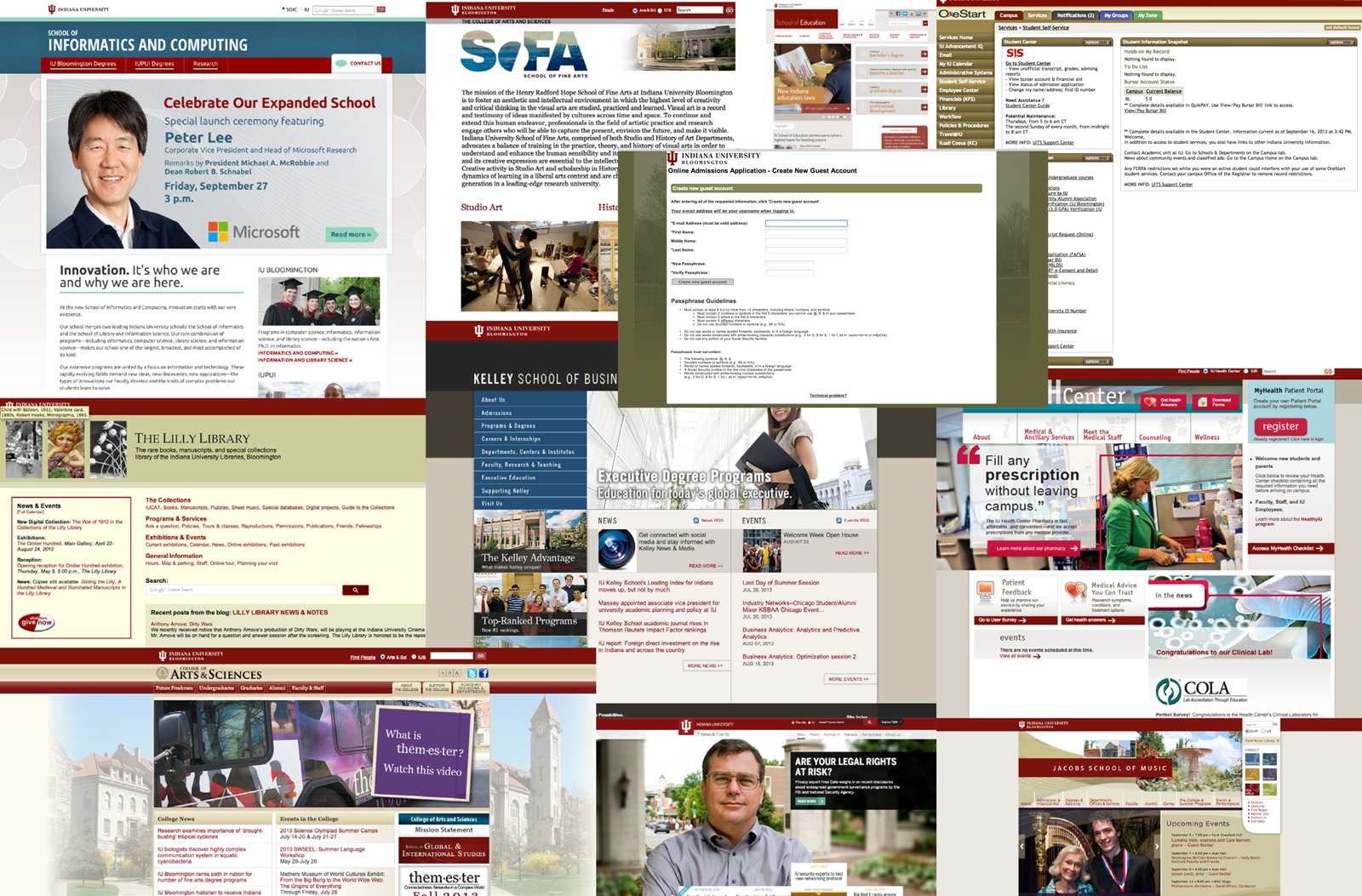
Decentralized Resources
We had nine campuses, hundreds of schools and departments, thousands of websites, and zero web design guidelines. Designers were distributed — some in the creative services office, some professionals embedded in schools, and others freelancers with little or no design experience. Without principles and a system, each designer was left to their own device.
Decentralized Resources
Many brands, many audiences
Centralized Resources
One brand, many audiences

Poor Accessibility on Mobile and a Broken User Experience
In the last two years, the number of high school students with mobile devices who visited college websites had doubled, and none of our sites were responsive. Usability and accessibility were all over the place.
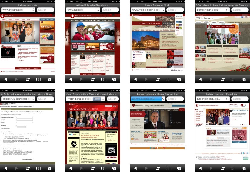
Lifetime student journey on a mobile device: IU Gateway, IU Bloomington, IU School of Music, IU Admissions, Online Application, Student Union, Alumni Association, IU Foundation.
It’s difficult enough to navigate a university's organizational structure without each site using different information architecture and navigation. Many sites crammed enormous amounts of info and decoration “above the fold” and there was no flow from one to the other.
When content, design, & engineering harmonize they create a purposeful brand experience.
Creating an Environment for Change
In order to make large strides, we first needed to identify roadblocks, mitigate risks, and generate alignment. The following keys were essential in order to launch a design that would transcend bureaucracy:
- The right creative team
- Administration-level buy in
- University-wide communication
- A solid solution partners would want to adopt
- The ability to iterate, improve, and release changes over time
As a team, we became advocates for a mobile-first approach that would focus on content instead of decoration and would unify our online brand presence. We sharpened our pitch, went on a roadshow tour, and spread a shared vision.
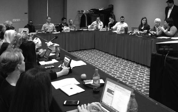
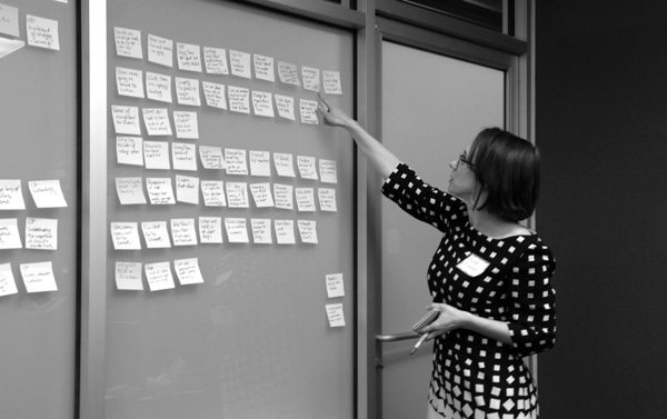
Stakeholder workshops and brainstorming sessions.
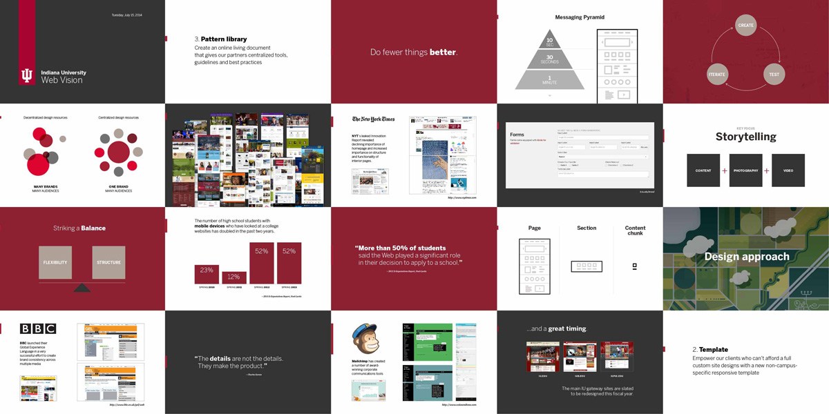
Slides from our IU Web Vision pitch deck.
The Design Approach
Research
The team began by facilitating an experience mapping workshop with key stakeholders and the IU Admissions Office staff (the campus group most knowledgable about the actions, feelings, and thoughts of incoming students.)
In preparation for the workshop our user experience group interviewed parents, prospective and new students, guidance counselors, and IU Staff. Those insights paired with the workshop discussions generated a shared sense of ownership of the problems and a momentum toward a strong solution.
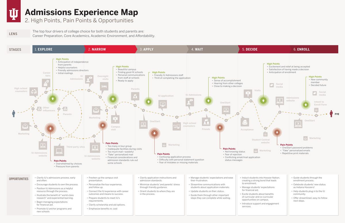
We conducted a competitive analysis of other colleges analyzing how they were solving similar problems, their style guides, and responsive design.
We also drew inspiration from outside the educational space looking at how big brands achieved a unified brand experience. We took notes from how the BBC's Global Experience language scaled across multiple mediums and online properties. We were inspired by the content strategy of MailChimp's Voice and Tone Guide. And our ears perked when we read in the leaked New York Times Innovation Report that they were focusing on a multiple-entry-point strategy as traffic was being redistributed away from their home page due to social media sharing and better search results.
A Focus on Content
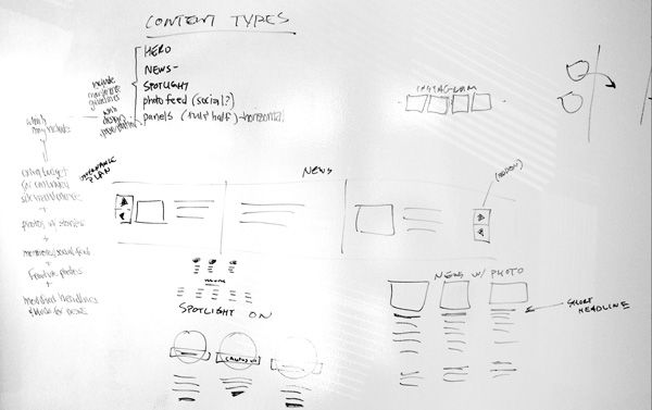
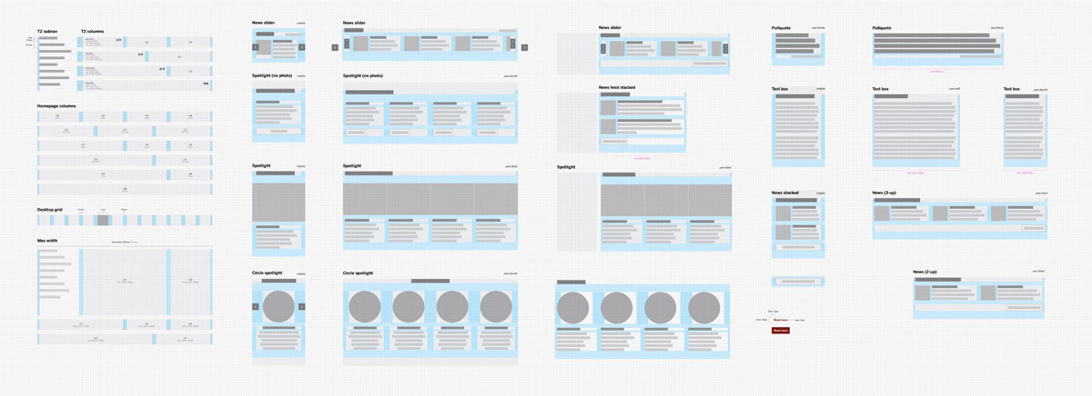
We had a vivid story to tell. When prospective students visited the beautiful IU campus, they were exponentially more likely to apply. Our goal was to make sure we were telling that story well and bringing the college experience to life on our sites well. The design team worked closely with content strategist, photographers,and videographers to identify themes of most commonly used content types on university websites then built patterns to fit the content rather than fitting the content to the design.
Mobile-First
We designed for the mobile experience first, then scaled those designs up to larger browser widths. This caused us to question content and minimize the number of elements present on the screen at one time making for a more consumable experience regardless of device.
Prototyping
The design team then explored a number of variations before narrowing to three concepts that represented all of the brainstorming work up to that point. We tested those concepts with students.
One Brand, Many Audiences
In parallel to the web design work, we were defining and testing a new master brand architecture that clearly articulated the University's strengths and differentiated us from our competitors. The visual expression began to converge with the new brand personality. A strong brand is consistent in presentation, so we created a system to identify subunits that wouldn't compromise brand integrity. Room for flexibility and variance of campuses, schools, and departments was left in the unique stories they had to share rather than a unique design look and feel.
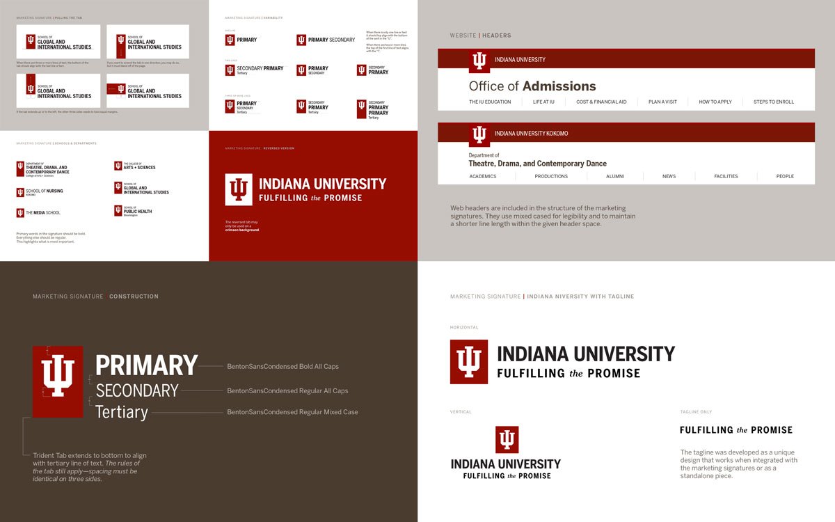
Implementation and Documentation
Once we converged on one design, we were ready to build. The designs were then broken up, iterated upon in the browser, and integrated into our university-wide content management system. We created detailed documentation explaining the patterns and best practices so that partner organization could easily manage and keep their content up to date.
The Results
From the beginning we set out to be the carrot and not the stick by creating a beautiful and useful tool that would maintain a strong visual identity across all sites while being flexible to express each departments unique value propositions.
We were so successful in our design system that partner organizations lined up to update their sites. In fact, within three years of the first site launch, the Creative Services team has delivered more than 400 new sites. The system has saved Indiana University immeasurable hours of design time and now has an online brand presence worthy of the world-class institution.